Sick & SoundRemoteBranding · Logo Design
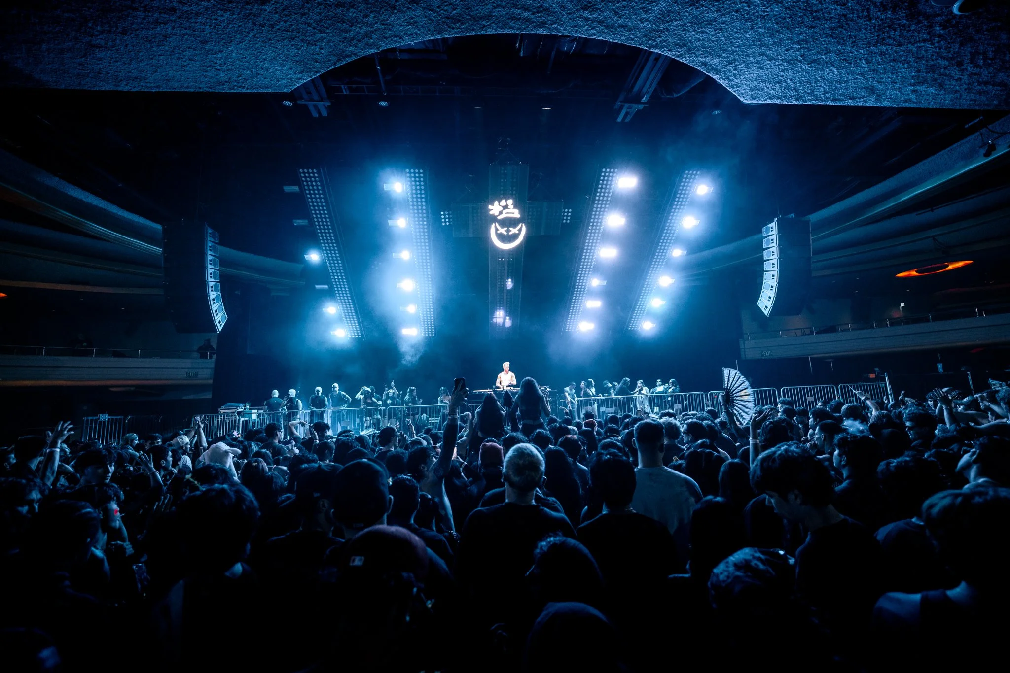
Sick & Sound is a collaborative label and management company based in Germany that represents techno artists. Each artist has a distinct sound and personality, requiring a visual identity that feels unique while still existing within the same high-energy world. In my role as brand designer, I developed custom logos and supporting visual elements that captured their individual styles and could be applied across social media, merchandise, promotional materials, and live events.
The Job
Kistenbrugger Rebranding
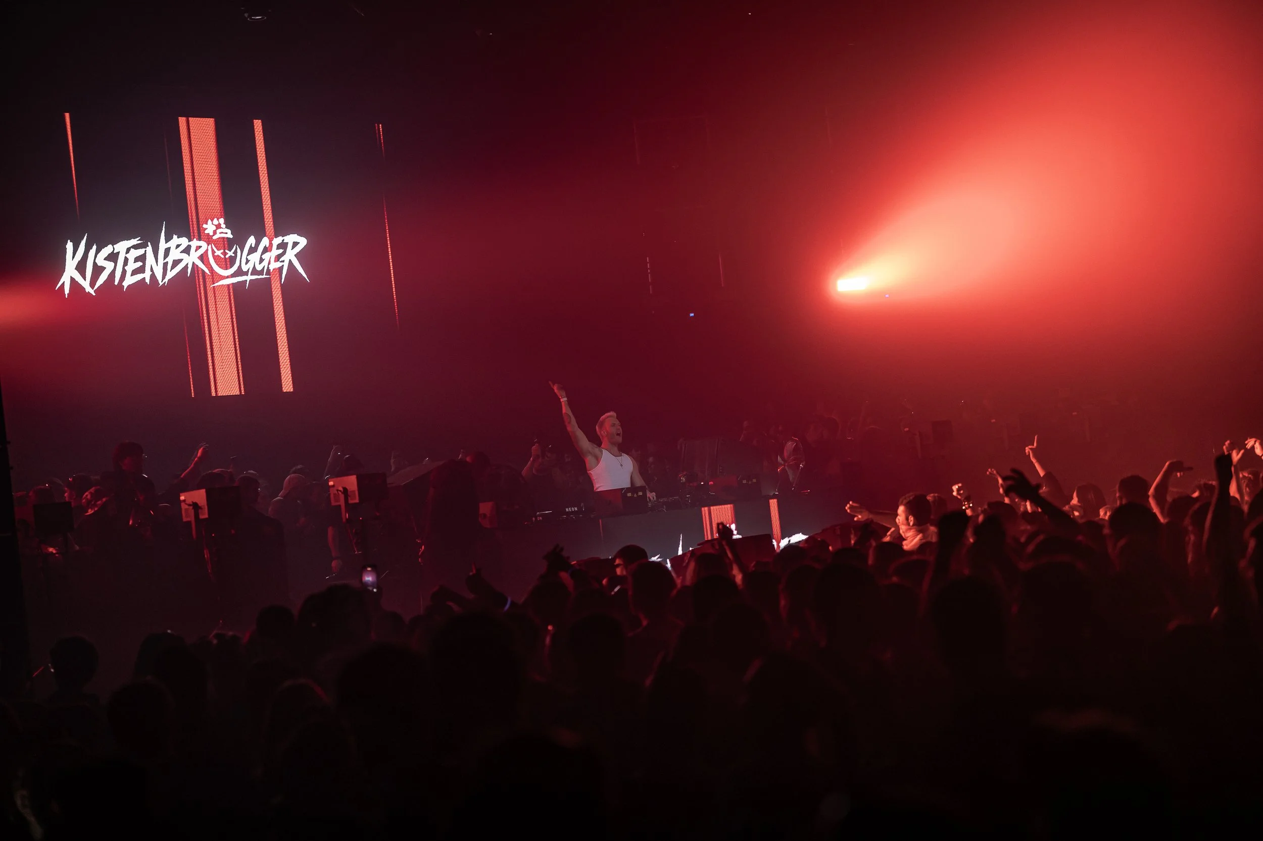
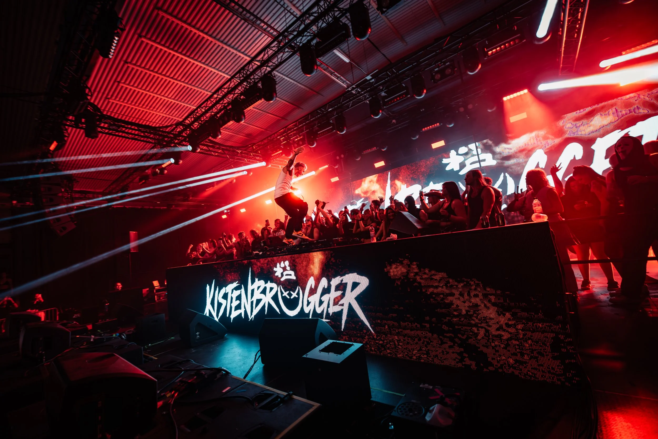
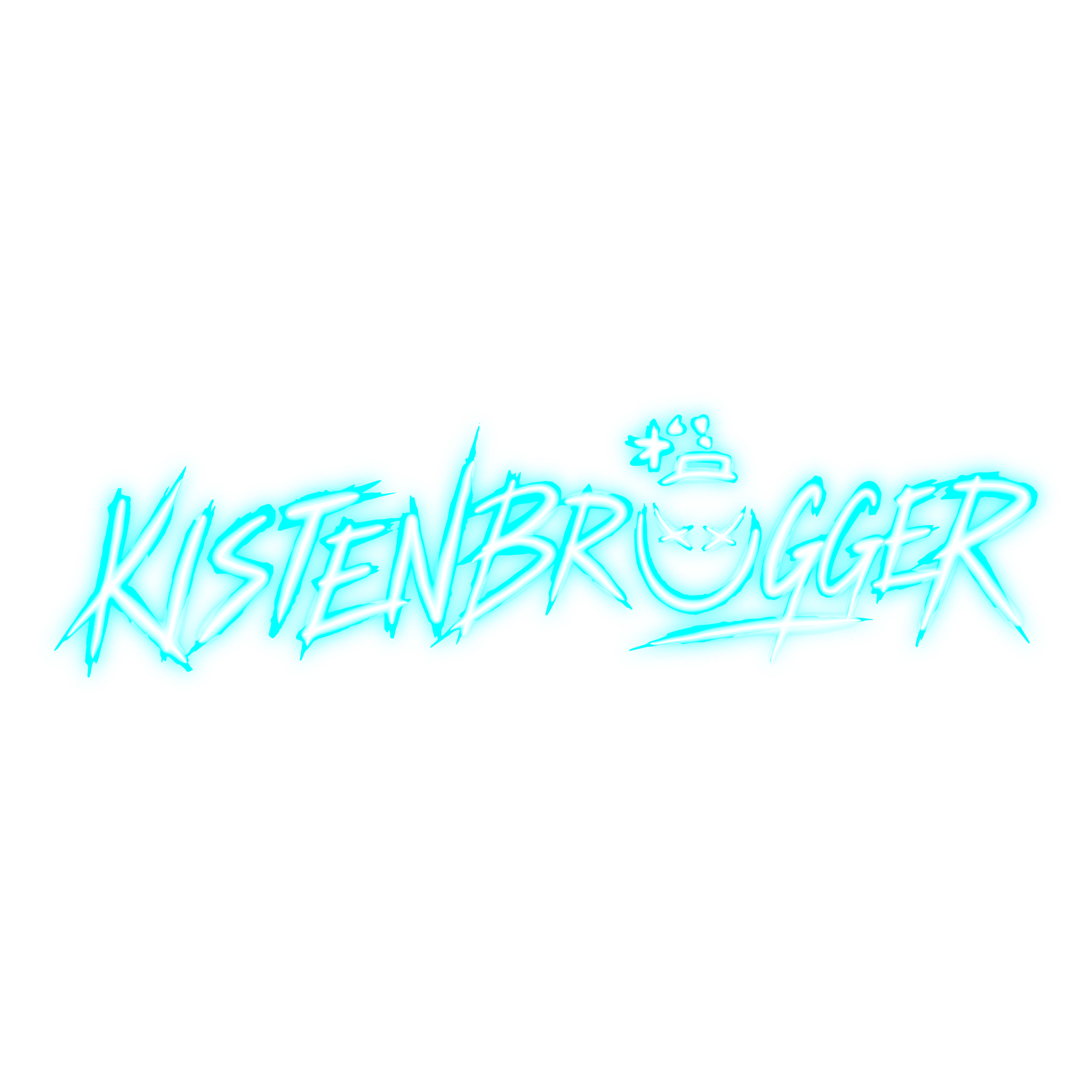
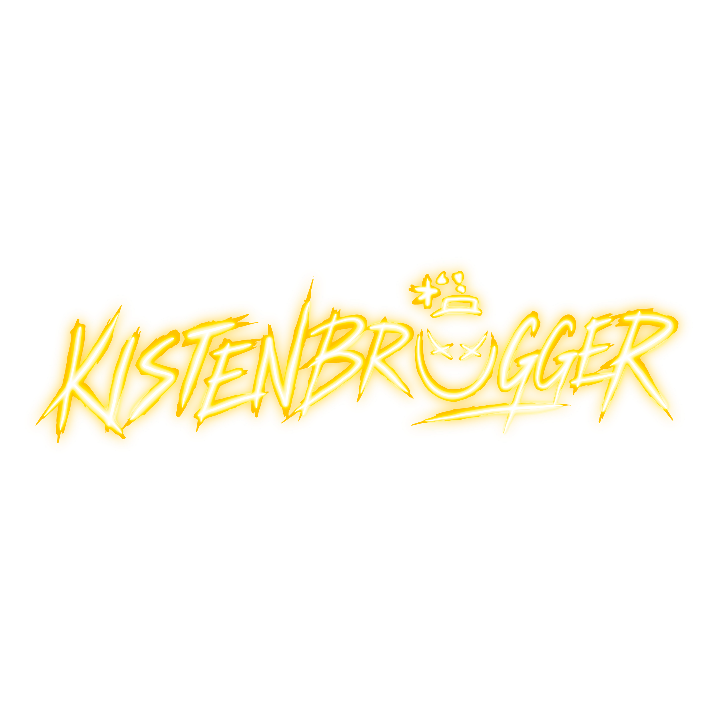
For Kistenbruegger’s rebrand, I developed a complete visual identity rooted in his sound, personality, audience, and goals within the European hard techno scene. I began by researching his target audience, analyzing the branding of other Sick & Sound artists, and presenting three creative directions: brutalist, futuristic, and clean and bold. From there, I explored multiple rounds of logo concepts, typography, color palettes, and custom iconography. The final direction combined an aggressive, hand-rendered wordmark with a devilish smile symbol incorporated into the name. I also tested the identity across festival lineups, event flyers, social media, and promotional content to ensure it was recognizable, versatile, and true to his style.
Design Problem

The primary challenge was creating a logo for Kistenbruegger’s unusually long artist name without it visually appearing as two separate words. The client had struggled with this in previous logo explorations, so the new identity needed to keep the name connected, legible, and recognizable while still capturing the bold energy of his hard techno style.
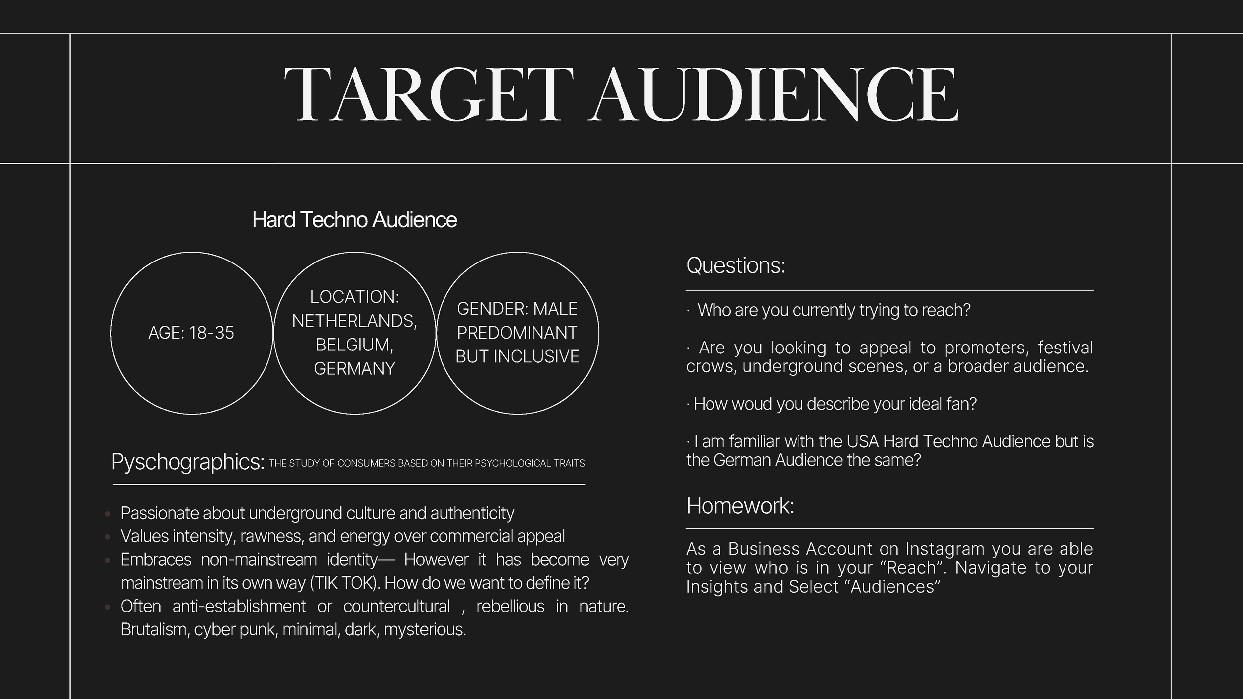
I researched Kistenbruegger’s target audience to understand the people his new identity needed to connect with—not only their age, location, and gender, but also their values and relationship with underground techno culture. This helped me create a visual direction that felt authentic to his existing audience while positioning him to reach new fans, promoters, and festivals throughout the European hard techno scene.
I researched Kistenbruegger’s target audience to understand the people his new identity needed to connect with—not only their age, location, and gender, but also their values and relationship with underground techno culture. This helped me create a visual direction that felt authentic to his existing audience while positioning him to reach new fans, promoters, and festivals throughout the European hard techno scene.
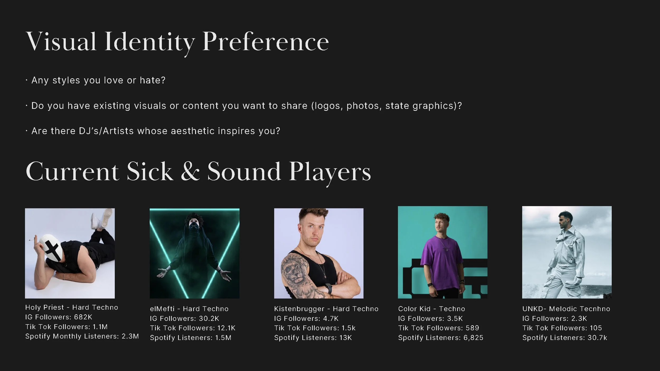
Moodboards
1st Renditions
2nd Renditions
Final Brand Guide
Final Logos



Results
· Increased Kistenbrugger’s following from 4.7K to 18.6K within six months—an increase of nearly 300%.
· Solved the primary design challenge by creating a cohesive logo that presented his long artist name clearly as one word.
· Developed a recognizable visual identity that captured the energy of his hard techno style.
· Created a flexible brand system that could be applied across social media, festival lineups, promotional graphics, merchandise, and live events.